Lord Ingvard's comic book redesigns are making their way across the net this week.
I posted the Red Sonja and Wonder Woman ones already.
Generally speaking I like the changes and can see them working. Though I will admit I am not sure he knows much about the history of the all characters he is talking about (he does have a good grip on Ms./Captain Marvel I will give him that).
http://lordingvard.tumblr.com/
http://www.ingvard.com
Let's look at his Zatanna.
ETA: Here is the image
He gets a few things right and a few wrong. Now mind you. This is *his* version and by default that means it is right for him. But I also ask how much can you change a character and still have it be the same character?
Ok so the punk style hair do, I love it. Black hair with streaks of purple (or blue) would be a great look for a younger Zee. I can totally see her looking like this while she was working on her undergrad degree.
The coat is very reminiscent of Constantine's trench coat. So this could even be early in her relationship with him.
I like the striped pants she is wearing; a nice call back to the striped socks you will sometimes see witched wear.
The choker necklace is cool, if a bit predictable.
I really, really love the look of this character. It is cool, hip and I want to know more about her.
I can't help but wonder though...don't we already have a Raven and a Traci 13?
There is a reason for her look.
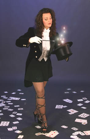
Zee dresses the way she does because that was how her dad dressed when he was on stage. She dresses like an old school magician because her dad was an old school magician. So the top hat, the fishnets are all apart of what her stage persona is. She might be the most powerful magician on Earth, but in her mind she will never be as good as her dad was.
Now, not to sound like "that guy" but I do wish he had done some research into these characters.
The part where he mentions "changing the color of the spandex" on Zee's art shows he really doesn't know much about these characters. Zee has one of the more recognizable looks of any superhero, male or female. The only hero she looks like is the one that in character she wants to look like; her dad.
Oh and the bit about modern magicians not dressing like this anymore? Two words. Misty Lee.
So I like the vision of his changes, but not for the reasons he gives.
In the end though I will agree with Zee herself. Her costume is fine as it is.


3 comments:
And for a guy who wants to make her stand out, she looks painfully like the Scarlet Witch from the new Avengers movie.
The problem is all his costume designs are the same model.
1. Go with dark, muted and functional costumes
2. Crop the hair short
Basically, it looks like everyone hired Batman for costume design.
If you're talking about a street fighting vigilante, that works. The Electra & Black Canary outfits work. But people like Supergirl or Wonder Woman should wear primary colors - they're not dark & gritty avengers, they're here to save the day. And capes may be impractical but they look cool which works for some superheroes. Of course he liked the Man of Steel costume which tells you a lot. Costumes should reflect character.
A couple of other minor complaints - the faces all look like teenage girls which is deeply wrong for some of them. Also, the hair thing is overblown - there are plenty of historical warrior cultures which were big on long hair. Warriors dressing in a plain and utilitarian fashion is a modern convention. I think he just likes short hair on women.
Ingvard's intent would work better if he had a more classic comic/superhero style of art. His style is great for a more Disney-esque sort of look but terrible for comparison to the more "realistic" style used for the comics he is contrasting with.
Post a Comment